PowerPlant
Stats for Plant Nerds
You’ve seen this screen before, probably being gestured at by a self-righteous owner of a hybrid. The little animated diagram that shows energy flowing between the engine, the electric motor, the battery, and the wheels. Arrows lighting up in real time. You can’t stop watching it. Probably the cause of more than a few distracted driving incidents, but hey, we’re saving the planet here.
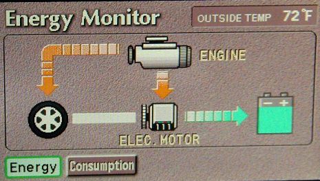
You’re not reading numbers. You’re watching the machine think. I don’t even own a Prius, but I have spent a few Lyft rides ignoring polite conversation and staring at that screen.
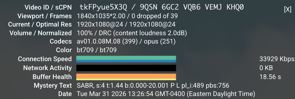
The other inspiration is YouTube’s “Stats for Nerds” overlay. Hidden in a right-click menu. Buffer health, codec, frame drops. Information that helps you watch a video in absolutely no way. I am not normal people.
I wanted both of those things, but for plants.
I’d already built a couple of world models before this one, and I’d noticed a pattern. If I couldn’t see the model’s internals, I’d glance at the outputs, decide “looks fine,” and move on. The model could be confidently hallucinating and I’d never know. Without visualization, a world model is basically a medieval theology exercise. You’re debating how many angels can dance on the head of a pin, except the angels are coefficients and the pin is a JSON blob you stopped reading three weeks ago.
For Phoebe to actually learn your plants, I need a clear way to understand how that learning is happening. My 15+ years of building dashboards of metrics I didn’t care about should come in handy here, if not for the low grade PTSD.
The KITT detour
I should confess that before arriving at the current design, I spent an evening trying to make it look like KITT from Knight Rider. Sweeping red scanner bar, black background, lots of attitude. It was going to be incredible.
Then I did the math on when Knight Rider aired and realized the target audience for that reference is now firmly in AARP territory. The 80s were a disturbingly long time ago. Looks like Darth Vader’s bathroom, indeed.
Starting from the wrong end
The normal way to build a monitoring system is: figure out what you can measure, then build a UI around those measurements. Sensor first, display second.
I did it backwards.
I started with what I wished I could see. If I could peer inside the relationship between a plant, its soil, the air around it, and the light hitting it, what would that look like? What would the Prius energy monitor for a plant show?
The answer turned out to be a real thing in plant science called the SPAC model. Soil-Plant-Atmosphere Continuum. It describes how water moves from the ground, through the plant, and out into the air. Energy comes in as light, gets converted, drives transpiration, interacts with temperature and humidity. It’s a complete system, and it has a main output you can actually predict.
Evapotranspiration (great band name)
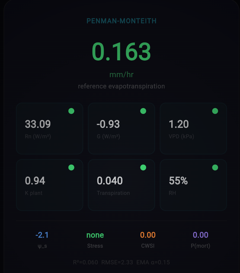
That output is called Evapotranspiration, or ET0. It’s the rate at which water moves from the soil through the plant and evaporates from the leaves. It’s computed using something called the Penman-Monteith equation, which takes solar radiation, temperature, humidity, and wind speed as inputs.
Evapotranspiration would also be an excellent name for a Finnish eco-punk ska band. I’m putting that out into the universe.
The reason ET0 matters is that it’s predictive. If Phoebe knows the light, temperature, humidity, and soil conditions, she can estimate how much water the plant should be using right now. Then she compares that prediction to what the sensors actually measure. If reality diverges from the model, something interesting is happening. Maybe the plant is stressed. Maybe the soil is drying faster than expected. Maybe Phoebe’s assumptions about the plant need tuning.
This is the core of the feedback loop. Predict, observe, compare, adjust. Over time, the model gets tighter. Phoebe gets to know your particular plant.
Building backwards, validating forwards
Once I had the dream dashboard sketched out, I needed to know if the science actually worked with our sensor suite. This is where things got a little unconventional.
I used agentic research. Pointed an AI at the academic literature and asked: given these five sensors (soil moisture, temperature, light, VOCs, and a microphone), which established plant science models can we actually compute? Not theoretically. Actually, with real readings from a $20 sensor package.
The answer was surprisingly encouraging. Brooks-Corey soil hydraulics give us water potential from moisture percentage. The Tetens formula gets us vapor pressure deficit from temperature. Lux converts to solar radiation. Combine all of that into Penman-Monteith and you get a credible ET0 estimate. The VOC sensor catches stress signals that the physics model can’t see. The microphone might detect cavitation events in the xylem (tiny air bubbles that form when a plant is severely water-stressed and its internal plumbing starts failing).
Not all of it works yet. Some of it might never work with these sensors. But enough of it does to make the model useful from day one.
The dashboard
PowerPlant lives in the app as an easter egg. From the plant detail screen, there’s a small button that takes you in. It’s not meant for everyone. It’s stats for nerds.
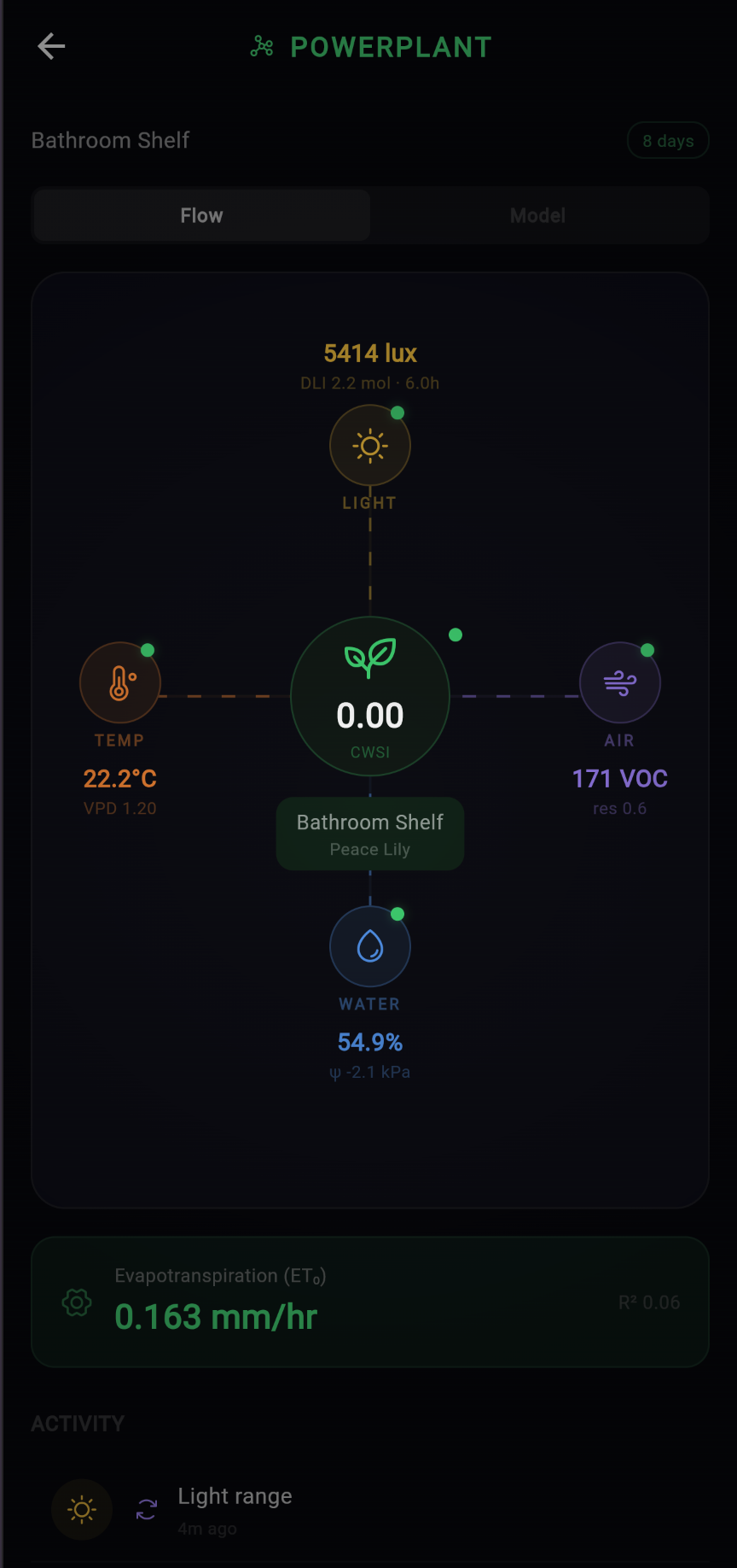
The Flow tab is the one I’m most proud of. Sensor data flows in from the edges. Light from the top, temperature and air quality from the sides, water from below. Everything converges on the plant at the center, and the model’s main output, ET0, sits at the bottom. It’s the energy monitor I wanted.
Switch to the Model tab and you get the Penman-Monteith engine internals. Every input, every intermediate calculation, every output. Net radiation, soil heat flux, vapor pressure deficit, wind speed. The equation is running live with your plant’s actual sensor data.
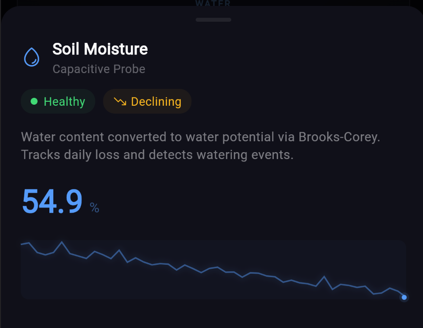
The detail panels let you drill into each sensor’s contribution. The moisture panel shows the Brooks-Corey conversion from raw percentage to water potential, with a sparkline of recent history.
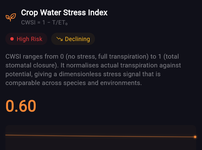
And the stress index takes everything the model knows and distills it into a single number. How stressed is your plant, right now, according to the physics?
Probably inadvisable, definitely interesting
To be clear: “design the fantasy dashboard first, then reverse-engineer the science to justify it” is not in any textbook I’m aware of. The approved methodology is to start with validated measurements and build up responsibly. I started with vibes and worked backwards. Publish or perish, but make it aesthetic.
But the Prius energy monitor wasn’t built because Toyota had leftover sensors. It was built because seeing the system changes how you interact with it. PowerPlant is that same bet, applied to a pothos on a bathroom shelf. The stakes could not be lower.
The model rebuilds every 6 hours. Each cycle, the physics get a little more calibrated to your specific plant, in your specific pot, in your specific room. Phoebe compares her predictions to reality, adjusts her coefficients, and logs every change. It’s supposed to be wrong at first and get better. Like a new hire, but with more differential equations.
Whether a $20 sensor and some borrowed agronomic math can actually model a houseplant remains to be seen. But I can confirm that watching a live CWSI reading tick up while your plant dries out is unreasonably compelling. The Prius effect is real. I texted my wife a few screenshots of Phoebe’s stress readings for her fiddle leaf fig and ZZ plant. That conversation is ongoing, and has already resulted in me being assigned plant care chores on her behalf “since I’m now the expert.”
— Ben